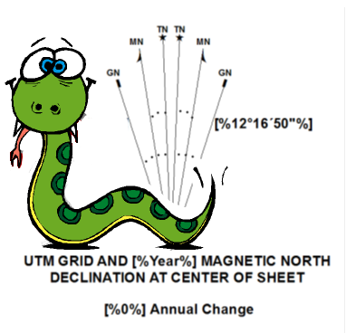
A declination diagram shows the angular relationship between grid, magnetic, and true north using a series of graphic arrows. A previous blog article on declination diagrams with ArcMap discussed what declination diagrams/north arrows are, and the different options for adding them to ArcMap.
Esri Production Mapping’s Topo North Arrow surround element (a USGS-style declination diagram) is mentioned in the blog. However, this element cannot be configured to change the diagram’s graphic appearance (such as font, arrow style, line length, color, etc.). Many users want the ability to change the styles of their diagrams, allowing them to meet their organization’s custom graphic specifications.
The just released Create Declination Diagram Template provides you with the ability to do just that! The provided map document has graphics that can be modified to change the look of the diagram. The Python tool updates those graphics to show the appropriate angles and values based on the current data frame extent using Production Mapping’s Magnetic Calculator geoprocessing tool.
With this Python-based approach of creating declination diagrams the graphics can be easily modified without any coding. The standard drawing tools in ArcMap can be used to make any necessary updates and the Python tool will still continue to work with the updated graphics. However, if you do want see how the magic works and/or change some of the dynamic behavior of the tool, the code is there for you to modify! All it takes is basic Python and arcpy knowledge.
Happy mapping!